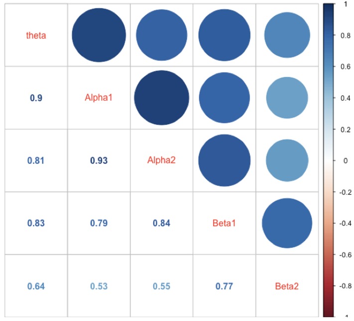
FIGURE 6.
Correlations between mean power values of the different frequency bands. The correlations are represented as numbers, circles, and blue hue. The size of the circles as well as the saturation of the color indicates the size of the correlation (the larger the circle the larger the correlation, or the bluer the circle or the number the larger the correlations). The diagonal shows the name of the frequency bands.

