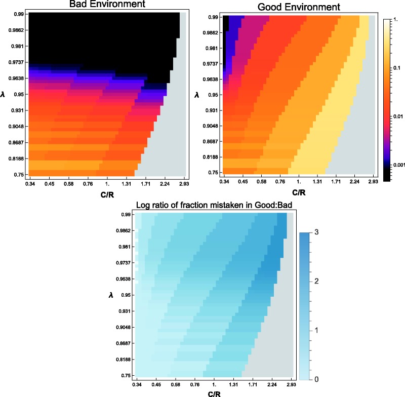
Figure A2.
Varying the discount factor and cost/reward ratio. With and , the upper panels show how the fraction of the population that is wrong about the environment varies as a function of λ and C/R. The upper left plot displays the fraction that thinks the environment is good when it is actually bad; the upper right plot displays the fraction that thinks the environment is bad when it is actually good. This fraction is measured at the time step that is closest to , the average lifespan given λ. (The faint horizontal bands towards the lower part of the plots are due to the fact that must be rounded to the nearest integer-valued time step.) The lower plot illustrates the log (base 10) of the ratio of incorrect inference rates in good and bad environments. Here, incorrect inferences are more common in good environments for all parameter values. The gray area in each plot is a region in which it is not worthwhile to start exploring at all

