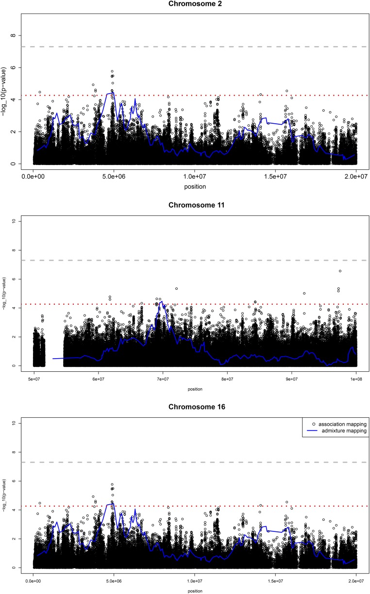
Figure 3.
Single-variant and admixture association analyses within the regions on chromosomes 2, 11, and 16 showing admixture mapping signals in the HCHS/SOL population, n=12,212. For each plot, the x axis is chromosome position and the y axis is the −log10(P value) for admixture mapping analyses (blue lines) and single SNP association with UACR (black dots). The red dashed line is the threshold for the genome-wide admixture mapping (P<5.7 × 10⁻⁵). The gray dashed line is the threshold for association if the study was a GWAS.

