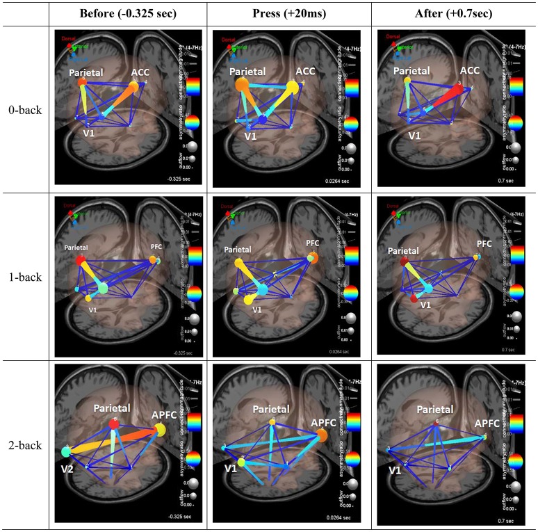
Figure 6.
Effective connectivity analysis. Three frames of a causal brain maps show transient theta information flow during correct commission: The frames correspond to −325 ms (left), 20 ms (center), and 70 ms (right) relative to the button press (0 ms). The color of the edges represents connectivity strength (i.e., amount of information flow along that edge.). Red = high connectivity, Green = low connectivity. The size of edges of the graph represents connectivity magnitude (absolute value of connectivity strength). The color of node represents the asymmetry ratio of connectivity for that source. Red = causal source, blue = causal sink, green = balanced flow. The size of a node represents the amount of information outflow from the source.

