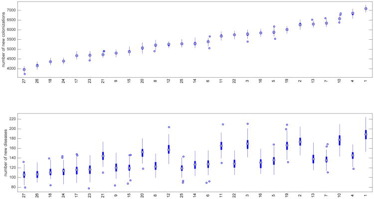
Fig. 1.
Box plots for strategies ranked by number of new colonizations at top and corresponding box plots for number of new diseases on bottom. The white dot in the center of each box plot represents the median. The upper and lower areas of each center box indicate the 75th and 25th percentiles respectively (50% of the values are included; the interquartile range (H) is the difference between the 2 percentiles). The whiskers on the lines are values that fall within 1.5 times H.

