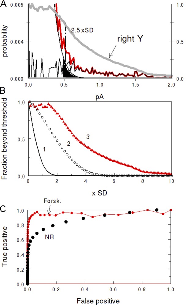
Figure 8.
ROC analysis of the dark noise. (A) The right tail of the histogram of total dark noise from Fig. 4 B. Red line, experimental histogram. Smooth black line, Gaussian of the continuous noise. The noisy black line is the difference between the two showing contribution of discrete events to total noise. Cut-off level set at 2.5 SDs of the Gaussian passes the signals from black-filled area, producing false alarms. The heavy gray curve shows the area below the noisy black curve as a function of the cut-off level, normalized to full area at zero cut-off. It shows the probability of true positive responses. (B) Fraction of continuous noise and discrete signals passing beyond a cut-off level plotted on x. Curve 1, continuous noise above threshold, i.e., false alarms. Circles 2, passed positive signal in normal Ringer (data taken from Fig. 4 A). Triangles 2, passed positive signal in forskolin, data from A. (C) ROC curves showing the relation between the probability of false alarms and true positive responses.

