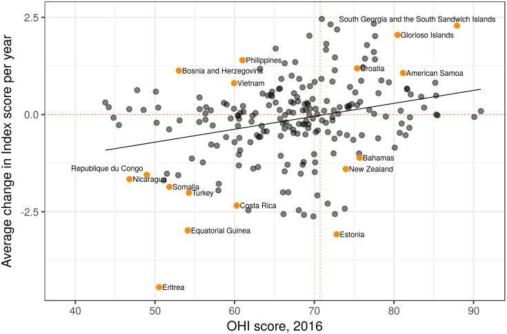
Fig 3. Relationship between score and annual change in score.
OHI scores for 2016 versus the annual change in score over 5 years for each region. Red dashed lines indicate no change over time (horizontal line) and the mean Index score across regions (vertical line); dark black line is the linear regression slope. Regions with higher Index scores in 2016 that improved through time are in the top-right quadrant, and countries with lower scores that declined through time are in the bottom-left. Data points for labeled countries are colored orange for ease of identification.

