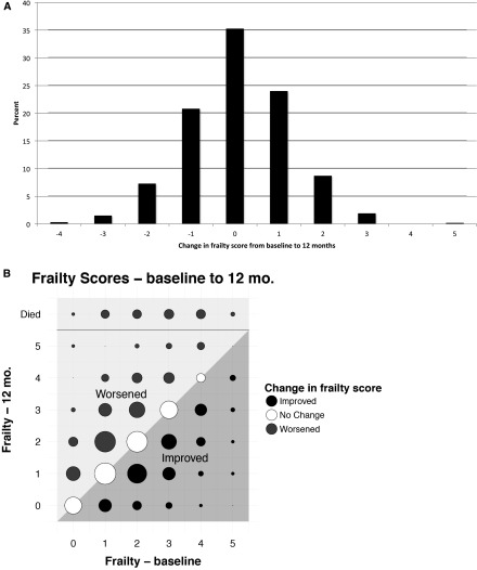
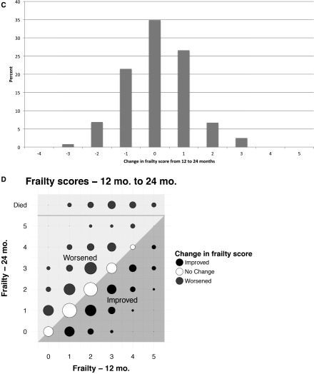
Figure 2.
Changes in frailty scores between baseline and 12 months and between 12 and 24 months. A shows a histogram of the change in scores from baseline to 12 months. The distribution of change was fairly symmetrical around zero. However, only 35% of patients did not change; more patients changed by one point than stayed the same. B shows frailty score at baseline on the x axis and 12 months on the y axis. The area of the circles is proportional to the number of patients in each point. The diagonal line indicates no change in frailty score, and the shading of the dots and the areas of the graph indicate improving or worsening of frailty. This illustration highlights that change occurred across the spectrum of baseline frailty score. C and D show similar data for changes between 12 and 24 months, and the changes were remarkably similar over the second year of observation.


