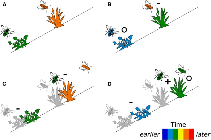
Fig. 1.
Conceptual depiction of phenological and distributional shifts in populations of plants and pollinators under climate change, with populations depicted as single icons (after Alexander et al., 2016). The timing of flowering for plants and activity for pollinators is represented as shades along a color scale. Pre–climate change distributions are shown in gray. (A) Positions occupied by populations pre–climate change (historical baseline). (B) Phenological/temporal shifts alone. (C) Distributional/spatial shifts alone. (D) Joint phenological/temporal and distributional/spatial shifts. (B–D) Each panel illustrates possible outcomes of shifts: (i) maintenance of historical interactions (indicated by O), (ii) loss of historical interactions (indicated by –), and (iii) gain of novel interactions (indicated by +). For simplicity, population abundances and shapes of distributions are not shown. Although some shift types in this figure appear to be less severe than others (D changes one interaction and maintains another, while C loses both interactions), these are intended only as example outcomes. The severity of the outcome will vary depending on the pre–climate change situation, the degree of shifting of each population, and many other factors.

