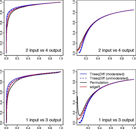
Fig. 2.

ROC curves (left) where y axis is the true positive rate and x axis is the false positive rate and False discovery curves (right) where y axis is the percentage false discoveries and x axis is the percentage of selected genes. Four methods applied to 20 simulated datasets and results are summarized over all datasets
