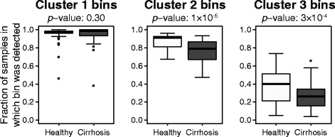
Fig. 8.

Box plots summarizing the number of healthy or cirrhosis patient samples in each viral bin. Results are summarized from the three bin clusters shown in Fig. 7. Horizontal bars indicate median values, boxes depict the first and third quartiles, whiskers depict minimum and maximum values, and outliers are shown as points. p values for Wilcoxon signed-rank one-sided tests comparing results for healthy and cirrhosis samples are listed above each graph
