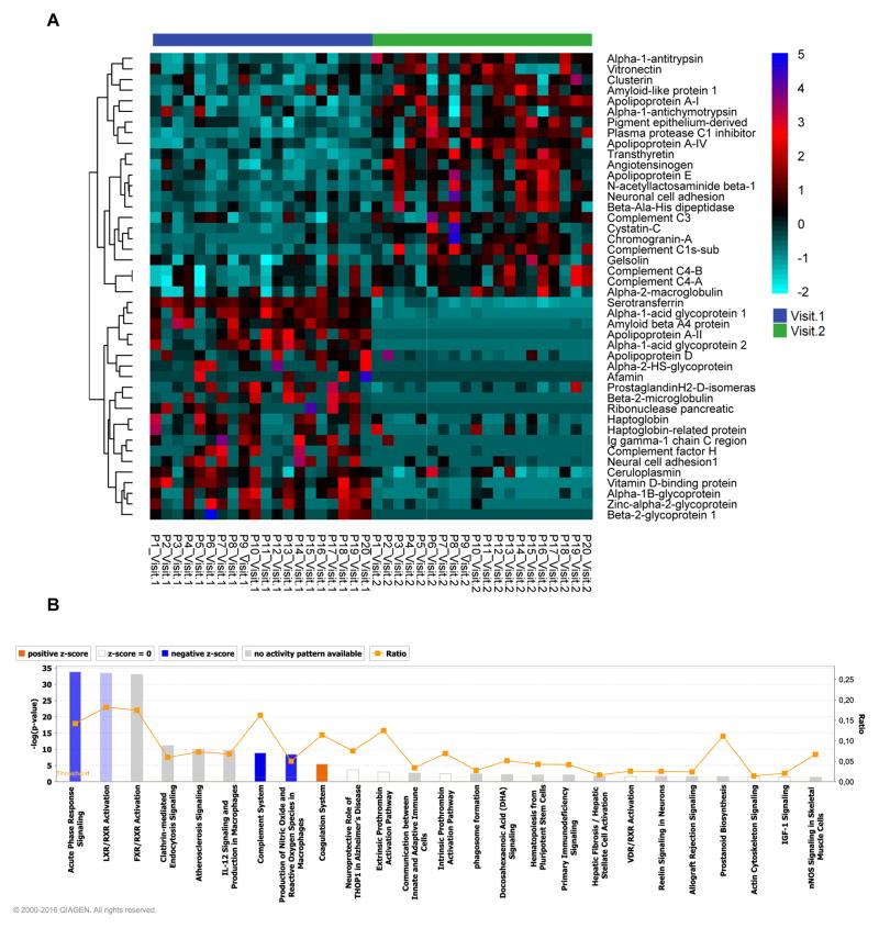
Figure 5. Changes in CSF protein content during cognitive improvement.
A) Heat map and hierarchical clustering showing CSF proteomes from subjects with improving cognitive status. Vertical lanes show the relative amounts of the indicated protein for individual subjects. Subjects are identified as P1–P20, and proteins are identified on the left. Blue labels indicate the baseline visit (visit 1) and green indicates the follow-up visit (visit 2). B) Ingenuity Pathway analysis of the CSF protein content at the follow-up visit for subjects with improving cognitive status. Combined bar charts (p value) and line graphs (ratio) show canonical pathways identified by IPA for subjects with A) worsening, and B) improving cognitive status. The pathways are ranked according to their p value. Orange depicts pathways with increased activity, and blue pathways depict reduced pathway activity.

