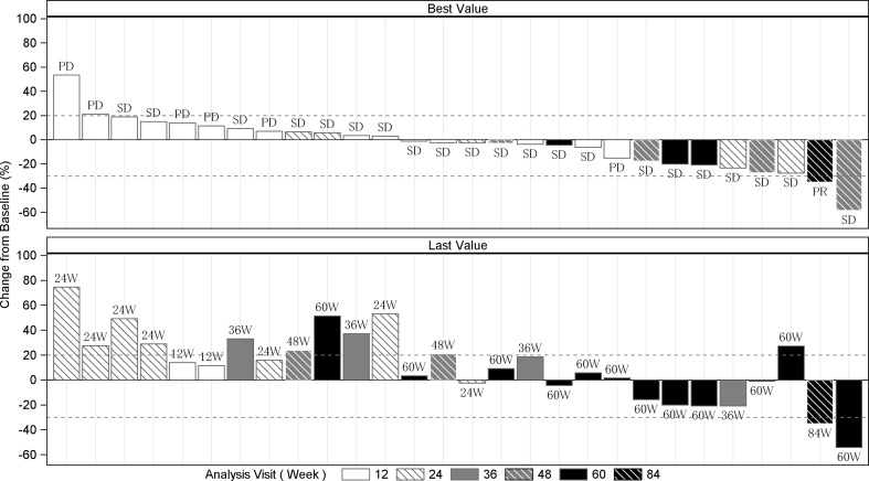
Fig. 3.
The best and the last percent change from baseline in the sum of the diameters of target lesion by patient (full analysis set, n = 28). Note: The best overall response results are shown in the bar graph at the top, and the numbers of weeks at the time point of the last observation are shown at the bottom. The study duration at the last observation is shown as the last value in the bar graph. Bars corresponding to results from the same patient are located in the same rows in the top and bottom charts

