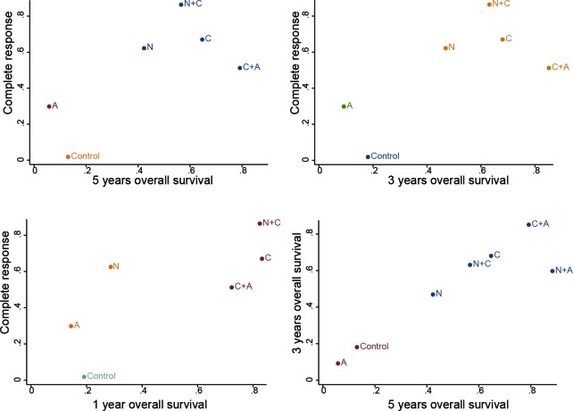
Figure 3. Clustered ranking plot of the network.
The plot is based on cluster analysis of surface under the cumulative ranking curves (SUCRA) values. Each plot shows SUCRA values for two outcomes. Each color represents a group of treatments that belong to the same cluster. Treatments lying in the upper right corner are more effective and safe than the other treatments.

