
Fig. 4.
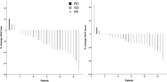
A waterfall plot of FLT-PET response measured as SUVmax and SUVmean. The percentage change in FLT uptake from baseline to the early response assessment is plotted on the y-axis and the patients are listed in order of the amount of change on the x-axis. The RECIST characterisations are colour-coded within the bar graph, showing that the patient with progressive disease has the highest increase in FLT uptake, while the patients with stable disease and a partial response are intermingled. Left panel: ΔSUVmax. Right panel: ΔSUVmean