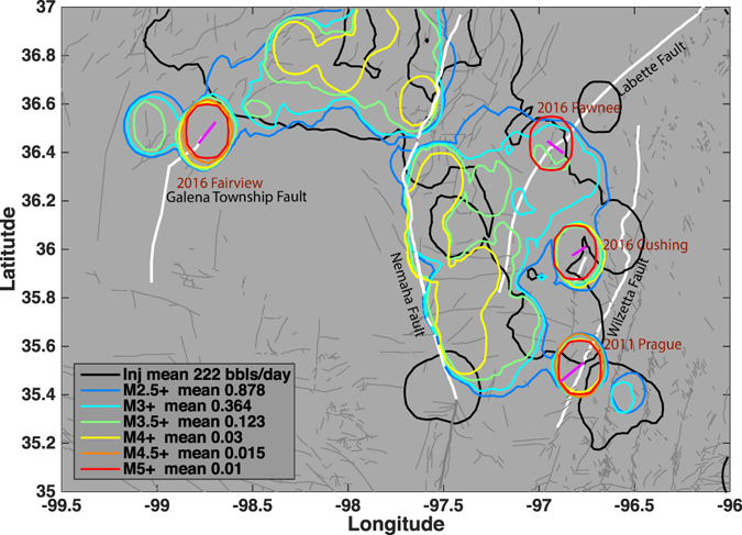
Figure 1.

Map view of event density distribution for different sized earthquakes and injection rates. Colored lines show the contour lines of average number of events for each magnitude range (see Legend). Gray lines show mapped faults from OGS database86. The major faults are labeled and shown in white thick lines. Thick purple lines denote the seismogenic faults for the four M5+ earthquakes delineated from earthquake locations. Each contour line represents spatial grids that have number of events larger than the average number of events per smoothed bin within the magnitude threshold. Individual density map is shown in Figure S1. The three M5+ sequences are well located at the edge of the seismic zones. The black contour line shows the spatial grids that have average injection rate from 2011 to 2016 higher than the average injection rate per smoothed bin. The figure is generated with Matlab 2015a, available at: http://www.mathworks.com/.
