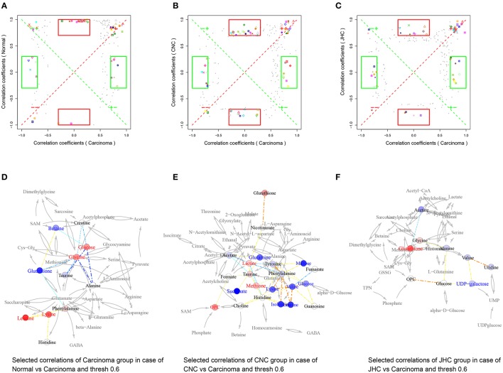
Figure 10.
Metabolic correlation network analysis for intestine tissues. SUS-plots were used to filter out characteristic correlations between groups (A–C). Metabolites with coefficients of Pearson's correlations that were above a threshold are connected by solid lines that are color-coded according to the values of the coefficients (a warm color represents a positive correlation, and a cool color represents a negative correlation). The width of each line is scaled based on its absolute values. The names of the metabolites shown in red and blue indicate that they were significantly increased and decreased in model (D), CNC (E), and JHC (F) groups, respectively. The gray lines between the metabolites indicate direct biological reactions.

