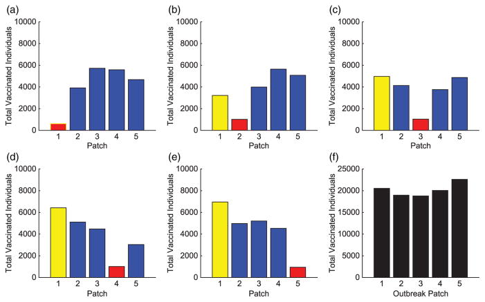
Figure 14.
Hot Spot 1 arrangement: total individuals vaccinated in each patch for each scenario. The total vaccinated in metapopulation for each scenario is given in (f). (The HS patch is shown in yellow and the outbreak patch is represented by red. When outbreak is in HS, it is represented by red with yellow border.)

