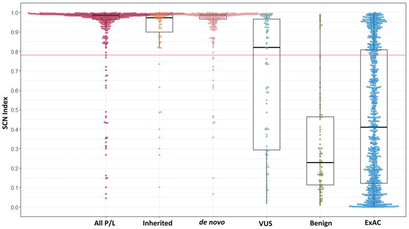
Figure 1. Box and whisker plots showing the distributions of SCN Indices between different classifications.
All groups are different from the pathogenic group (p<0.001). In an additional comparison between the inherited and de novo variants was also statistically significant (p=0.001). The red line across the graph represents the optimized threshold above which the SCN Index predicts a variant is pathogenic. The box represents the 25–75th percentiles, bar within each box is the median; whiskers mark the outliers within 1.5 times the interquartile range; and the colored circles represent the individual data points. The exact values are listed in Table 3.

