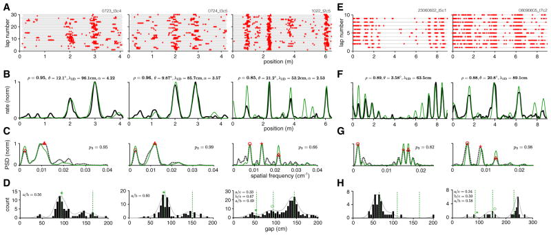
Figure 4. 1D Spatial Tuning Curves Can Be Well Fit by Lattice Slices.
(A) Spike rasters of three cells on a linear virtual track (right: same cell as in Figure 1D, top; center, left: cells recorded from different animals on different dates [Domnisoru et al., 2013]).
(B–D) Smoothed trial-averaged rate (B, black), PSD (C, dashed black), and gap histogram (D, black bars; smoothed histogram indicated by solid gray line) for the same three cells. Gaps are computed from adjacent bursts per trial and pooled across trials. Red symbols in (C) indicate the PSD peaks used to generate the best-fit slice. The rate prediction from the slice is shown in (B, green), with fit quality (Pearson’s correlation coefficient between lattice slice prediction and neural tuning curve) and slice parameters noted at top. PSD of the slice (C, green). Green dashed line in (D): predicted peak locations for the gap distribution obtained by multiplying the ideal predicted gap ratios by the scale factor of the best-fit slice; green symbols: ideal gap ratios multiplied by the position of the actual rightmost peak in the gap distribution.
(E–H) The same as (A)–(D), for two cells from animals running on a long linear track (Brun et al., 2008).

