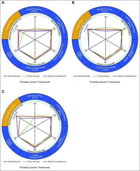
FIG 2.
Radar chart plots of outcome and cost metrics for all three treatment modalities for prostate cancer under alternative cost plotting methods. (A and B) The scaled to predetermined upper limit (SPUL) cost method. (C) The minimum-maximum (Min-Max) swap cost method. (A and B) In the SPUL cost method, treatment costs are incorporated into the radar chart diagram by being plotted as the difference of the cost from a predetermined upper limit value. In these two examples, the indexed cost axis transformed under the SPUL cost method is determined from a predetermined upper limit value that is censored, given the proprietary nature of medical center costs, with the upper limit in panel (B) set at 3.5 times that set in panel (A). As the difference between the predetermined upper limit value and actual costs of treatment increase, the plotted points appear more closely together on the costing axis (B). (C) The Min-Max swap cost method addresses the limitation of the reciprocal cost plotting method and SPUL cost plotting method by incorporating a linear transformation of the data by swapping the values of the minimum and maximum costs. However, data transformation is more complicated in this method and seemed to be less intuitive when interpreting the radar chart cost axis. Axes for outcome (the Expanded Prostate Cancer Index Composite [EPIC] health-related quality of life domains sexual function, urinary incontinence, urinary bother, bowel bother, and vitality) as well as the scaled cost axis are equally scaled from 0 to 100. See the Appendix for further discussion.

