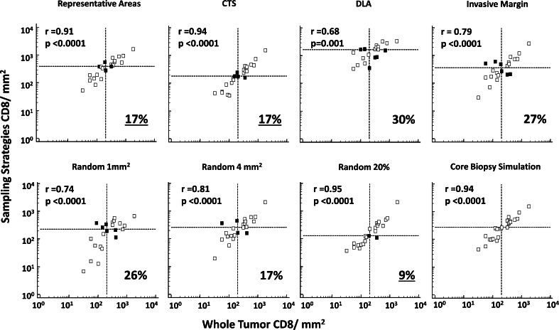
Fig. 3.
Associations between CD8 densities obtained by the different sampling strategies, and whole tumor. Scatter plots represent the CD8 count from the different sampling strategies (y-axis) versus the whole tumor (x-axis) numbers; numbers are reported in log transform. Pearson correlation coefficients (r) and the corresponding p values are noted. Dotted lines represent the median CD8 count as obtained by each strategy. Misclassified tumors, tumors for which relationship to the median on experimental sample is different than the relationship to the median on the whole tumor, are represented in the top left and lower right quadrants of the dotted lines (dark squares); percent misclassification is noted in the right lower corner of each graph. CTS central tumor sampling, DLA dense lymphoid aggregate

