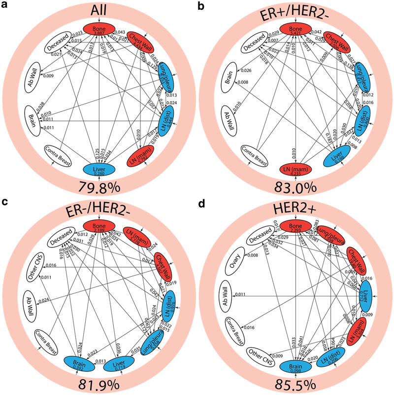
Figure 4.
Pathway diagrams showing top 30 two-step pathways emanating from breast (pink ring). Nodes are classified as a “spreader” (red) or “sponge” (blue) based on the ratio of the incoming and outgoing two-step probabilities (spreader and sponge factor listed in respective ovals). (a) All patients’ pathway diagram representing 79.8% of total pathways, (b) ER+/HER2− pathway diagram representing 83.0% of total pathways, (c) ER−/HER2− pathway diagram representing 81.9% of total pathways, and (d) HER2+ pathway diagram representing 85.5% of total pathways.

