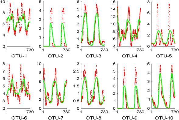
Figure 5.

Predictions of abundances of individual OTUs plotted over a period of 2 years. Each subplot shows the mean of observed abundances (red dots) and the annual predicted values of Model #3 (green). The x axis shows the day within a 2-year period, and the y axis represents the abundances as percentages of the overall population.
