
Fig. 6. Changes of PM2.5 exposure concentrations in urban areas of individual cities as a result of population migration in 2010.
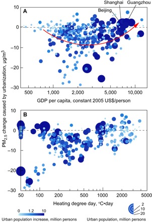
Each bubble represents an individual city. The areas of the bubbles are proportional to urban population in the city. The shades of the bubbles represent the increase in urban population since 1980. (A) Relationship between the migration-induced change in PM2.5 exposure concentrations with GDPcap. (B) Relationship between the migration-induced change in PM2.5 exposure concentrations with HDD.