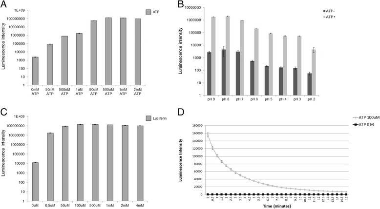
Fig. 1.

Luciferase assay optimization. a ATP titration: The graph represents the light intensity of each reaction containing different ATP concentrations as indicated. b pH titration: The graph represents the light intensity of each reaction at different pH. c Luciferin titration: The graph represents the light intensity of each reaction using different luciferase concentrations as indicated. Graphs A, B and C are in logarithm scale. d Light emission decay time: The graph represents the time that the red luciferase emits light. The means and standard deviations of all graphs were obtained from quadruplicate experiments
