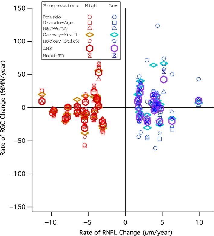
Figure 4.

Comparison of global rate of retinal ganglion cell (RGC) change (y‐axis) and global rate of retinal nerve fibre layer (RNFL) change (x‐axis) for subjects in the progression groups defined by RNFL thickness change. Red markers show high progression group subjects and blue markers show low progression group subjects. Circles show the Drasdo model, squares show the Drasdo Age‐corrected model, triangles show the Harwerth model, diamonds show the Garway‐Heath model, pentagons show the Hockey‐Stick model, hexagons show the Linear mean sensitivity model (LMS model), and hourglasses show the Hood model.
