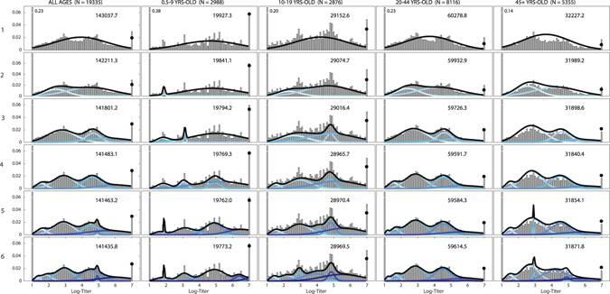
Figure 4.

Titer histograms and fit results for mixture models with different numbers of components (label on the left is the number of mixture components) and grouped by different age groups recommended by the CONCISE (http://consise.tghn.org/) consortium for 2009 H1N1 influenza. Histograms are weighted to adjust for age and gender according to the Vietnam national housing census in 2009. The numbers in the upper right corner of each panel are the fitted BIC scores of the respective model. For each panel, the blue lines are the normalized probability density of the component distributions with darker colors used for increasing μ. Black lines are the total mixture distribution density; and the black dots are estimated probability weight of the mixture model for titers ≥7.0. The fractions of individuals with titers below the detection limit of 20 and above 1280 that were out of the plotting ranges are shown next to their respective bars.
