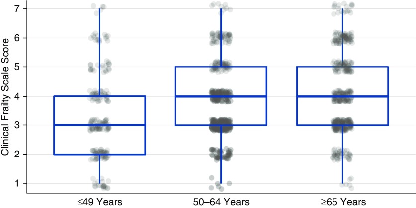
Figure 1.
Distribution of Clinical Frailty Scale (CFS) scores according to age. Box plots represent the median (horizontal line) and interquartile range (top and bottom of box represent the 75th percentile and 25th percentile, respectively) of CFS scores for each age group. Scatter plots represent the CFS score for individual patients.

