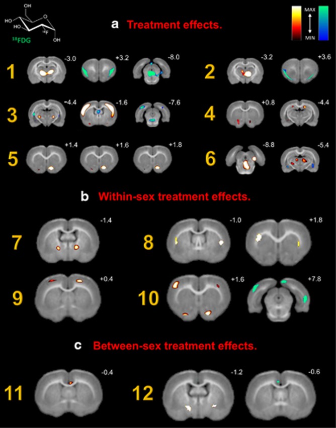
Figure 2.
18FDG microPET images highlighting significant brain regions. Coronal slices of (A) baseline brain metabolism between males and females, (B) changes in brain metabolism following acute withdrawal, and (C) changes in male brain metabolism. Slice distance in millimeters from bregma is noted in the upper right hand corner of each image. Significant increases and decreases in regional brain glucose metabolism are visually represented using hot (red–yellow) and winter (blue–green) color maps, respectively. MAX and MIN refer to the degree of regional radioisotope decay (percent injected dose per gram). The color scale used represents all T distributions achieving statistical significance. All corresponding brain areas are significant at a value of p⩽0.001 (corrected) with a cluster-extent threshold of k=0 voxels.

