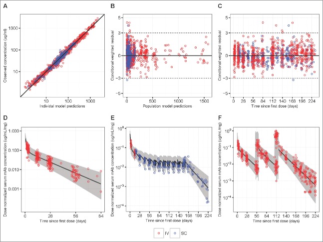
Figure 3.
Goodness-of-fit plots obtained from the final model of IV infusion (red) and SC injection (blue) groups in HVTN104. Panels A-C are model diagnostic plots: (A) observed vs. individual-predicted concentration with an identity line, (B) conditional weighted residual vs. population predicted concentration, and (C) conditional weighted residual vs. time since first IV or SC dose (days). Data from multiple time-points of a participant are individually displayed, not aggregated. Panels D-F are visual prediction check (VPC) plots: (D) dose-normalized observed data from both the q4 and q8 weekly groups and simulated data after a single infusion of 10, 20, 30, or 40 mg/kg IV VRC01, (E) dose-normalized observed data from the SC injection Group 3 with an IV loading dose, and (F) dose-normalized observed data from the q8 weekly groups and simulated data after multiple infusions of 10, 30, or 40 mg/kg IV VRC01. In the VPC plots, lines show medians, and shaded areas show bands covered by the 2.5th and 97.5th percentiles for simulated concentrations. Simulated concentrations were computed from 1000 trials simulated using dosing, sampling, and covariate values from the observed data set.

