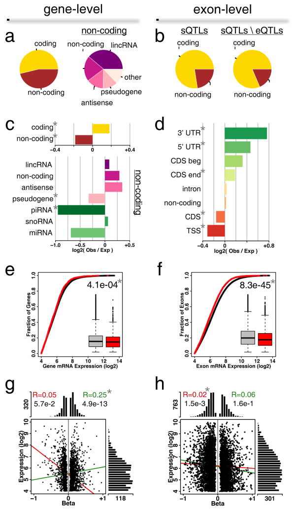
Figure 3.
Characterization of eGenes in DRGs. (a) Classes of genes associated at gene-level or (b) exon-level. Pie charts track the relative counts per category. sQTL refers to splicing eQTL; total sQTLs genes classes (left) are compared with the sQTLs classes resulting from the removal of those that are also eQTLs (right). (c) Gene class enrichment for gene-level associations. Horizontal barplots represent enrichment of log-ratios of observed counts to expected counts. (d) Exon class enrichment for exon-level associations. Classes are 5′UTR, 3′UTR, coding sequence (CDS) beginning (CDS beg) and ending (CDS end), intron, transcription start site (TSS), pre-TSS, and non-coding. (e) Expression levels for all genes versus eGenes at gene-level or (f) exon-level. Shown insets are box-and-whisker plots for all genes (grey) or eGenes (red). U-test P-value between the two distributions is shown. (g) Relationship between expression level and cis-eQTL effect size (beta) for gene-level or (h) exon-level associations. Histograms show the distribution of scattered points along the two main axes. Lines show correlations between expression levels and beta (positive beta, green; negative beta, red). Pearson’s correlation coefficient values are indicated at the top. In all panels, a star * indicates statistical significance after Bonferroni correction for gene classes following a binomial test for enrichment of observed over expected.

