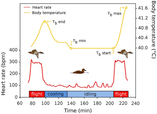
Figure 1.

Schematic representation of a flight cycle during migration of common eiders. The red line depicts the heart rate of two flights, and the time interval between flights, used to quantify flight occurrence and flight duration of this study. The yellow line shows the (smoothed) variation of Tb in relation to time in the flight cycle. See text for definitions of acronyms.
