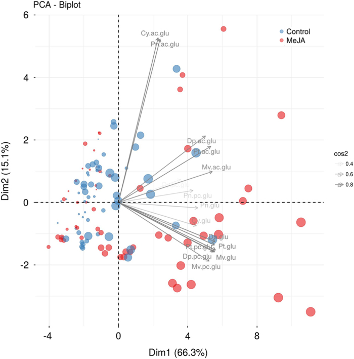
Figure 1.

Biplot of the Principal Component Analysis (PCA) on the autoscaled data showing the projection of the data set in the PC1×PC2 plane. The size of each dot is proportional to the sampling time (1–18 days). The gray arrows show the contribution of the metabolites to each principal component. Transparency is used to highlight metabolites strongly contributing to the PC1×PC2 projection.
