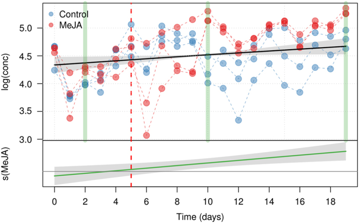
Figure 7.

Comparison between GAM analysis and t-test performed at each separate time point on the Cy-glu concentration. The vertical green bars highlight the time points where the concentration in treated and untreated cells was significantly different (BH—FDR correction at the 0.01 level). The upper plot shows the fitted smooth of the common trend (scm(t)), while the lower graph (MeJA) shows the additional effect of the MeJA term (sMeJA(t)). The shaded area of the trends are the 95% confidence intervals of the fitted smoothers. The day of MeJA elicitation is indicated by a red dashed line.
