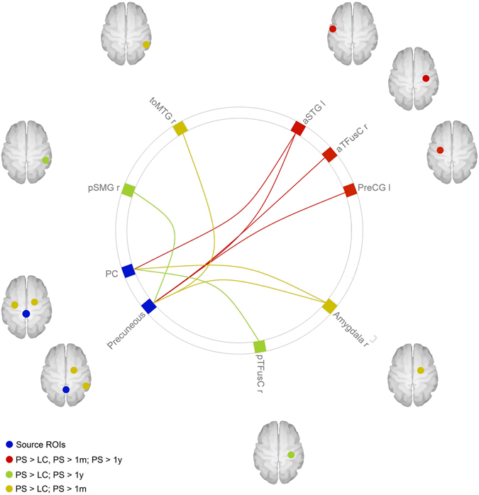
Figure 1.

Seed-to-target connectivity changes over time. The figure shows the seed-to-ROI connectivity found to be significantly different between groups. The red lines represent connections found to be stronger in presurgery patients (PS) compared to all other groups (lean controls, 1 month follow-up and 1 year follow-up). The yellow lines represent connections where a minor change occurred, as they were found to be stronger in presurgery patients compared with both lean controls (LS) and 1 month follow-up (1 m), but not to 1 year follow-up (1 y) nor between lean controls and 1 year follow-up. The green lines represent the connections where a change in connectivity was observed more slowly, as their connectivity was stronger in presurgery patients compared with lean controls and 1 year follow-up, but not compared with 1 month follow-up. All results were significant with a p < 0.05, corrected for multiple comparisons with a FDR approach. The image was generated with the CONN software used for the analysis.
