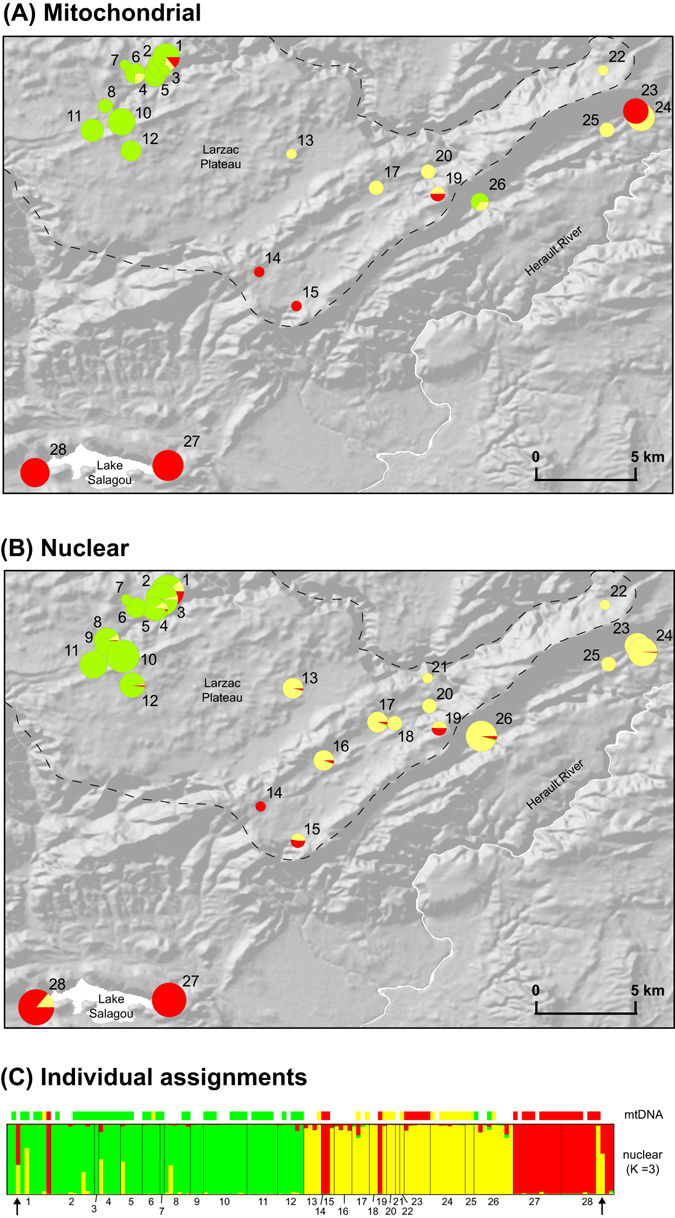
Figure 2.

(A) Distribution of mitochondrial lineages, (B) nuclear clusters in the study area based on STRUCTURE average admixture proportions (for K = 3) and (C) individual STRUCTURE admixture proportions and mitotypes. Pie charts are proportional to sample sizes. Barplots show individual assignment for K = 3 (best solution according to the Pr(X│K) statistic) and mitotypes. The dash line delimits the Larzac Plateau. Red: P. perezi, yellow: P. kurtmuelleri, green: P. ridibundus. Arrows highlight the two individuals identified as a hypothetical P. kurtmuelleri × P. perezi new klepton. The maps were built using ArcGIS 9.3 (http://www.esri.com/arcgis/about-arcgis).
