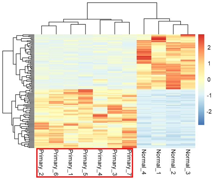
Figure 2.

Heat map of clustering analysis of differentially expressed genes. The color change from blue to orange represents the expression value change from downregulation (blue) to upregulation (red). The sample numbers are presented below, including 7 disease samples (primary) and 4 normal samples.
