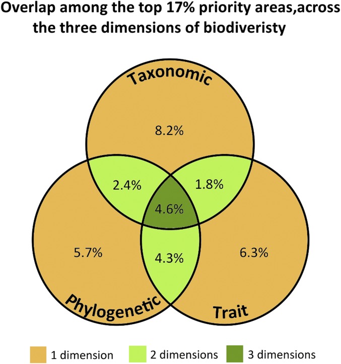
Fig. 2.
Venn diagram showing the proportion of the land surface where we can observe the overlap between the top 17% priority areas across the taxonomic, phylogenetic, and trait dimensions of biodiversity, referent to the overlap map presented in Fig. 1. For example, only 1.8% of the land was selected as an area of priority for both the taxonomic and trait dimensions. The color scheme is that used in the overlap map in Fig. 1.

