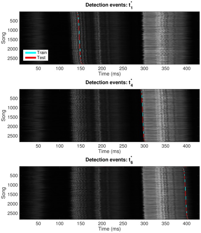
Fig 2. Each plot shows one network output unit’s responses to all 2818 presentations of lny64’s song shown in Fig 1.
We show only the syllables , , and , and we do not show the non-response to presentation of non-song. The horizontal axis is time relative to the beginning of the aligned song, and the vertical axis is an index for the 2818 individual song presentations. The grey shading shows the audio amplitude of song Y at time T. Detection events on training songs are shown in cyan, with detections of unseen test songs in red. To provide an intuition of intra-song variability, songs have been stably sorted by the time of detection events; thus, each of the three detection graphs shows the songs in a different order.

