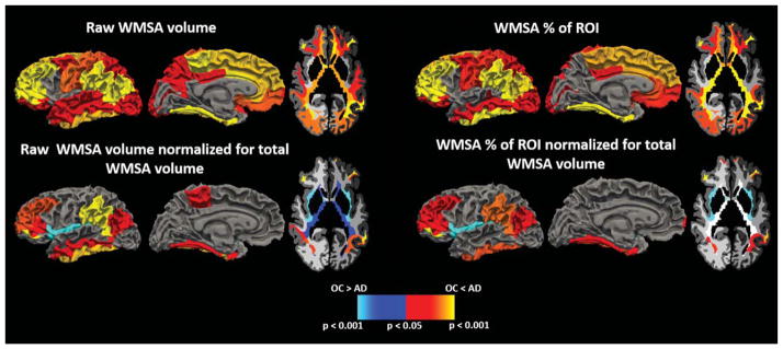
Fig. 1.
Regions demonstrating group differences in WMSA between AD and OC individuals when using raw WMSA volume as a metric (top left), raw WMSA volume normalized to total WMSA volume (bottom left), WMSA percent of ROI WM (top right), and WMSA percent of ROI WM normalized for total WMSA volume (bottom right). Warm colors indicate where AD have higher WMSA burdens than OC, and cool colors represent where OC have higher WMSA burdens than AD.

