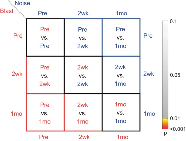
Fig. 1.

Statistics color map key. A color map is used to illustrate P values for data. Grayscale colors indicate nonsignificant effect (P > 0.01). “Hot” colors (yellow to red) indicate significant effect (P < 0.01), with red indicating values <0.001. Boxes outlined in black are between-group comparisons at each time point (blast vs. noise). Red and blue boxes indicate within-group comparisons at different time points for blast (red) and noise (blue), respectively. Pre, preexposure to blast or noise; 2wk, 2 wk after exposure; 1mo, 1 mo after exposure.
