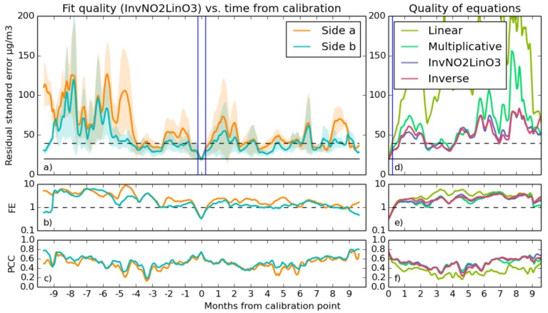
Figure 10.
Long-term experiment performance for a pair of sensor elements, calibrated for NO2 using the inverse NO2 linear O3 equation. Shown in the largest graph (a) is the mean rolling Residual Standard Error (RSE) for the pair, with the shaded region showing the range within which 95% of the fits were performed. (b) is a graph of logarithmic Fractional Error (FE), and (c) shows the rolling fit Pearson Correlation Coefficient (PCC) against time From Calibration (tFC). In the right graphs is a comparison of different equations with the sensor pair results and positive and negative times averaged together. The blue line delineates the calibration period; the horizontal solid black line indicates the target accuracy of 20 ; and the dotted black line is twice this. On the right in graphs (d–f) are a comparison of the performance of the four different equations referenced in Section 3.2.1. Each data point in these graphs is an average of the absolute time from calibration and of both sensors.

