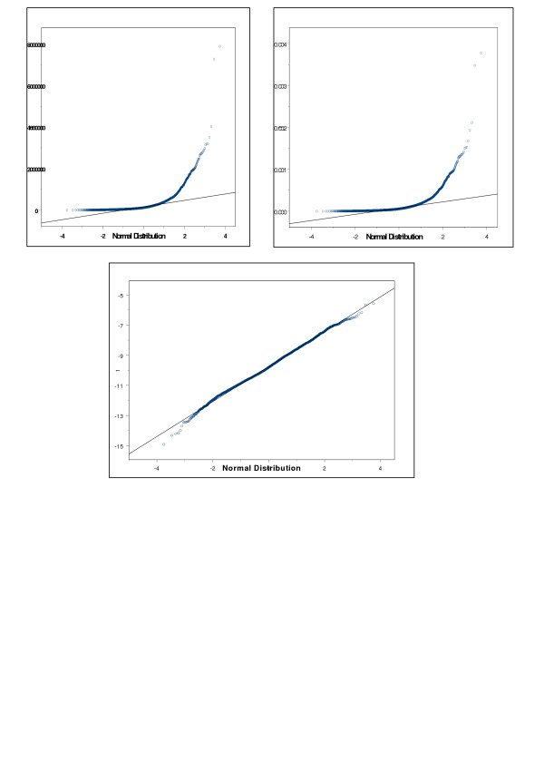
Figure 3.

Intensity plots. (a) Plot of raw intensities before log-transformation and normalization. Probability plot of raw intensities of 201 spots in the final data set; a normally distributed variable is expected to plot a line close to the straight line; the intensities are very skewed. (b) Plot of Normalized spot intensities. Probability plot of normalized spot intensities of 201 spots in the final data set. Comparison of 3a and 3b demonstrates that the normalization does not alter the distribution of the spot intensities. (c) QQ plot of log transformed intensities. Figure 3c demonstrates that the log transformation successfully transforms the highly skewed distribution of spots into a normal distribution.
