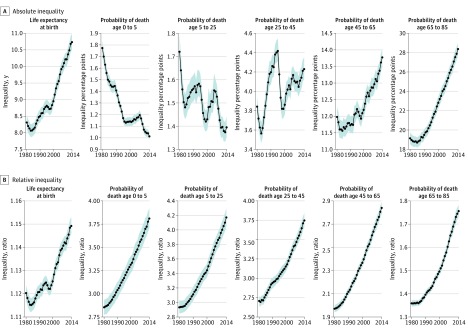
Figure 3. Absolute and Relative Inequality Among Counties in Life Expectancy and Age-Specific Mortality Risks, 1980–2014.
Shaded areas along the plotted data represent 95% uncertainty intervals. Absolute geographic inequality was quantified as the difference between the 99th and first percentile level, and relative geographic inequality was quantified as the ratio of the 99th to the first percentile level.

