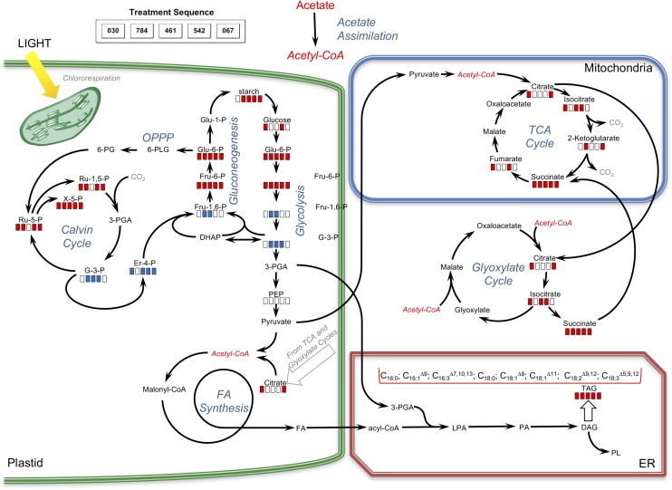
Figure 9.
Pathway map representing the impacts of various compounds on carbon metabolism. Red bars indicate significantly increased levels of metabolites in compound-treated samples relative to controls; blue bars indicate significantly decreased levels of metabolites in compound-treated samples relative to controls; and white bars indicate no significant differences between treated and control samples. For the quantitation of changes, see Table IV and Supplemental Table S4, A and B.

