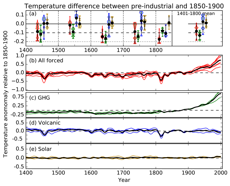
Fig 2. Model simulated difference in global mean temperature between different pre-industrial periods and 1850-1900.
a) Range of ensemble means for different models, and for different forcing combinations. Model distribution fitted with a Kernel Density Estimate (violin plot) - red: All forcings combined; green: greenhouse gas forcing only, blue: volcanic forcing only, yellow: solar forcing only. Model mean: circle, 10-90% model range: bar. Differences refer to the mean of the period enclosed by the dotted lines; except on far right where they are means for the full period 1401-1800 (relative to 1850 to 1900). b)-e) Model means for different forcing combinations, colours ensemble means for individual models, black line – mean over all models.

