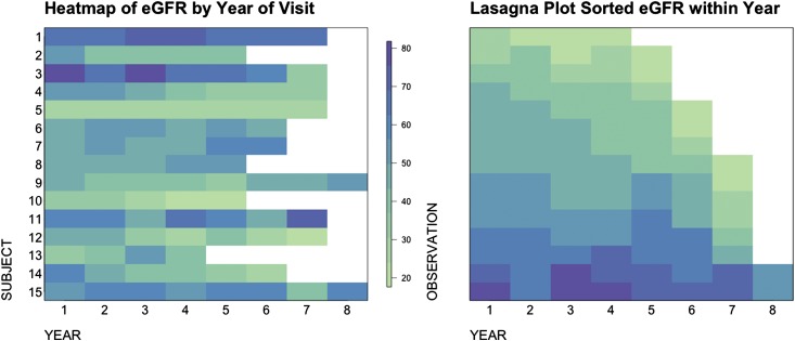
Figure 2.
Heat map (left panel) and lasagna plot (right panel) plot on the basis of the same 15 subjects. Each row of the heat map represents eGFR values from one subject, and the color indicates the level of eGFR values. The lasagna plot is a heat map sorted by color gradients to reflect the overall eGFR distributions in the population at each visit.

