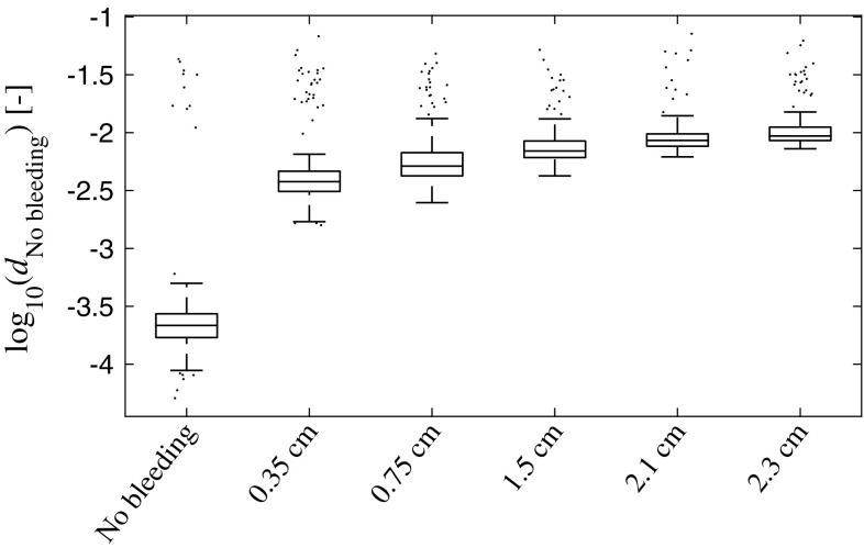
Fig. 8.
Box plot showing the distances to the No bleeding class of the training data, for all bleeding sizes of the simulated validation dataset. The line in the middle of the box shows the median, and the bottom and the top of the box show the 25th and 75th percentile, respectively. The whiskers extend to 1.5 times the inter-quartile range away from the top or bottom of the box, or to the furthest observations from the box. Data points outside the whiskers are plotted individually. We see that correlates with bleeding size; which is consistent with the result for the original simulation dataset (Fig. 6)

