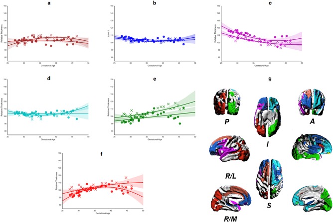
Figure 10.

Regional analysis of thickness changes for the largest contiguous cluster of vertices. (a–f) Mean thickness change, in GM (cross) and WM (circle), calculated for each significant ROI, for all brains mapped against age at scan. Each panel shows the best‐fit model against age for each ROI (WM, solid; GM, dashed): (g) shows the 3D surface representations of significant ROIs. The direction legends are as follows: R, right; L, lateral; M, medial; S, superior; I, inferior; A, anterior; P, posterior. The color of each ROI corresponds to the color used for the growth rate plot lines (a–f). [Color figure can be viewed at http://wileyonlinelibrary.com]
